My full portfolio of work is available on request
Business Stationery
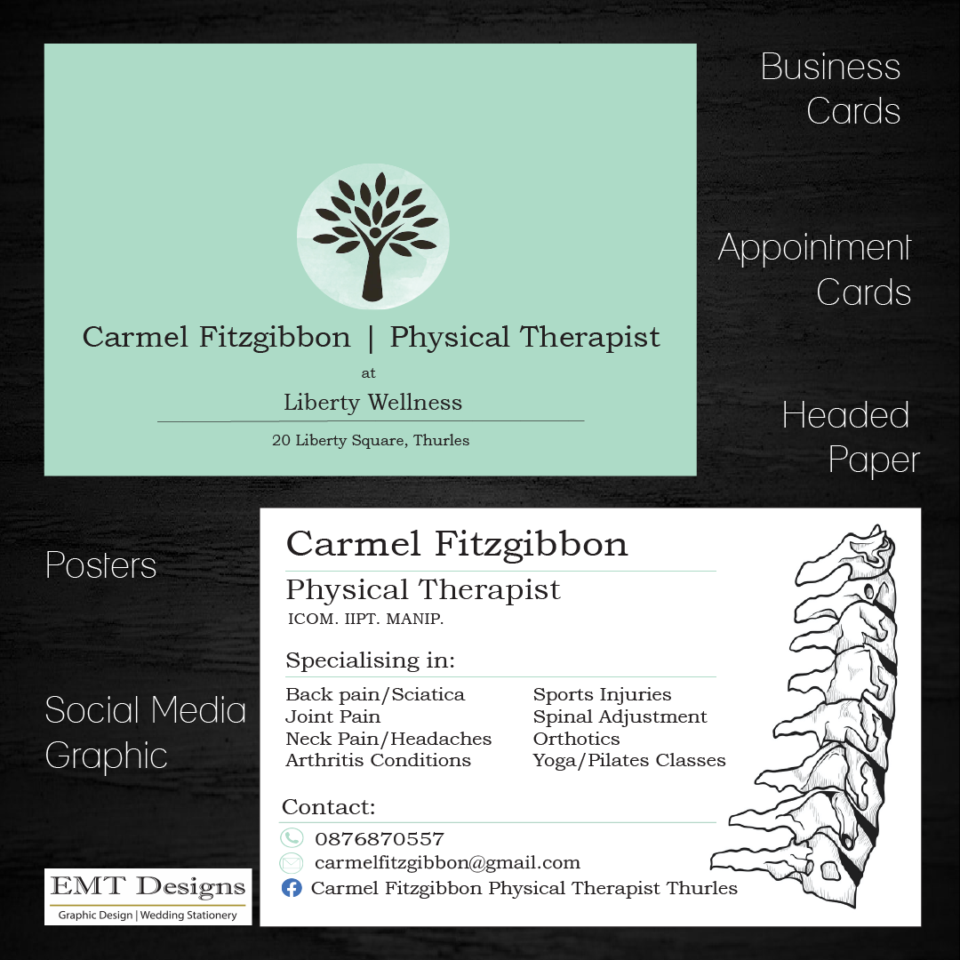
Carmel Fitzgibbon | Physical Therapist
Carmel wanted to link her stationery to her new logo & premises. She told me she wanted to incorporate her new logo & colour into her stationery as much as possible. As she shares her new space with another colleague, I felt it was important to spell out her particular service on her stationery. I also used her unique green colour from her logo in a slightly darker tone to make the logo stand out. Carmel already had a sign for the front door made & so I matched the same type font in ** . Her one requirement was to somehow add a spine to her stationery, which I subtly included i.
Once the basics were decided, Carmel asked for a full set of stationery including business cards (as seen below), appointment cards, posters for her Pilates classes, social media backgrounds & headed paper.
Movie Poster
Gravity | Sci Fi
In a recent college course, we were asked to demonstrate our new skills in Photoshop by creating a movie poster from scratch.
The skills required included image placement, masks, filters, clipping masks, selection tools, camera raw effects, duplication of layers, type face & text placement.
By using blur filters, selection tools & masks I was able to add an astronaut, add blurred explosive effect & enhance the colours of the earth.

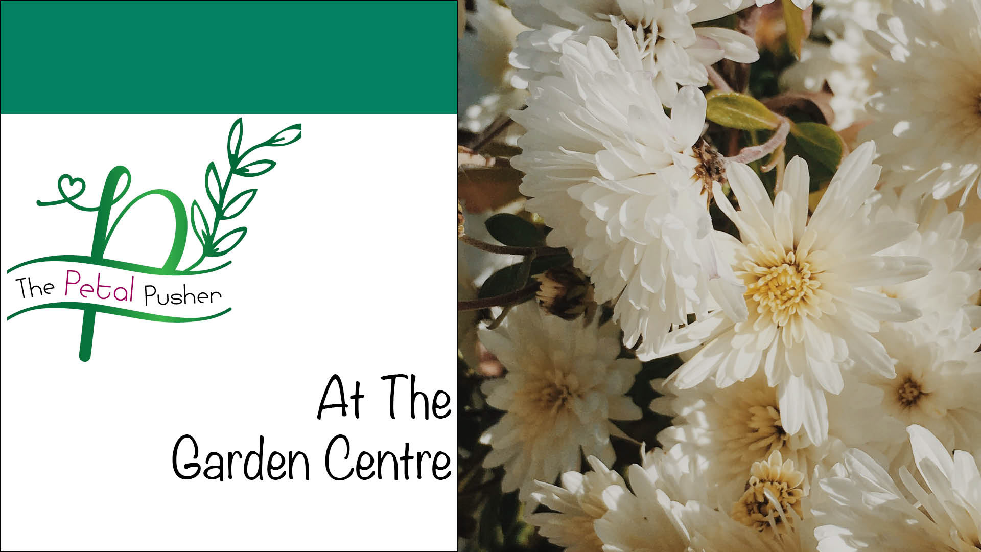
Interactive PDF
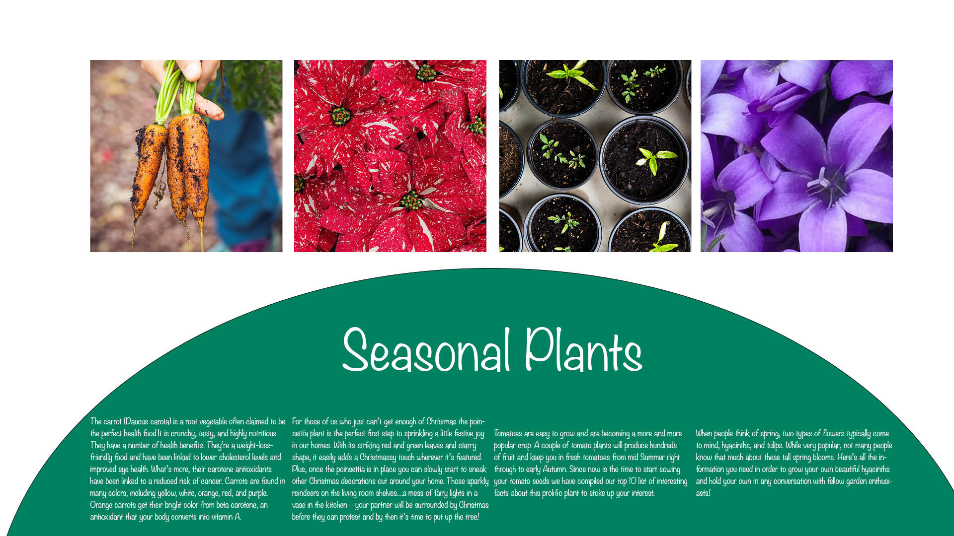
The Petal Pusher | Garden Centre
I was recently asked to design a personal logo, create a brochure and make it interactive by a local horticulturist.
To be included was their products & services available, seasonal information, promotion of their Christmas stock & Open Day, as well as a working QR code & interactive Google Map. I added a number of buttons to allow for the user to interact with the PDF. I also included a number of images from their supplies to continuously move on each page.

Product Design
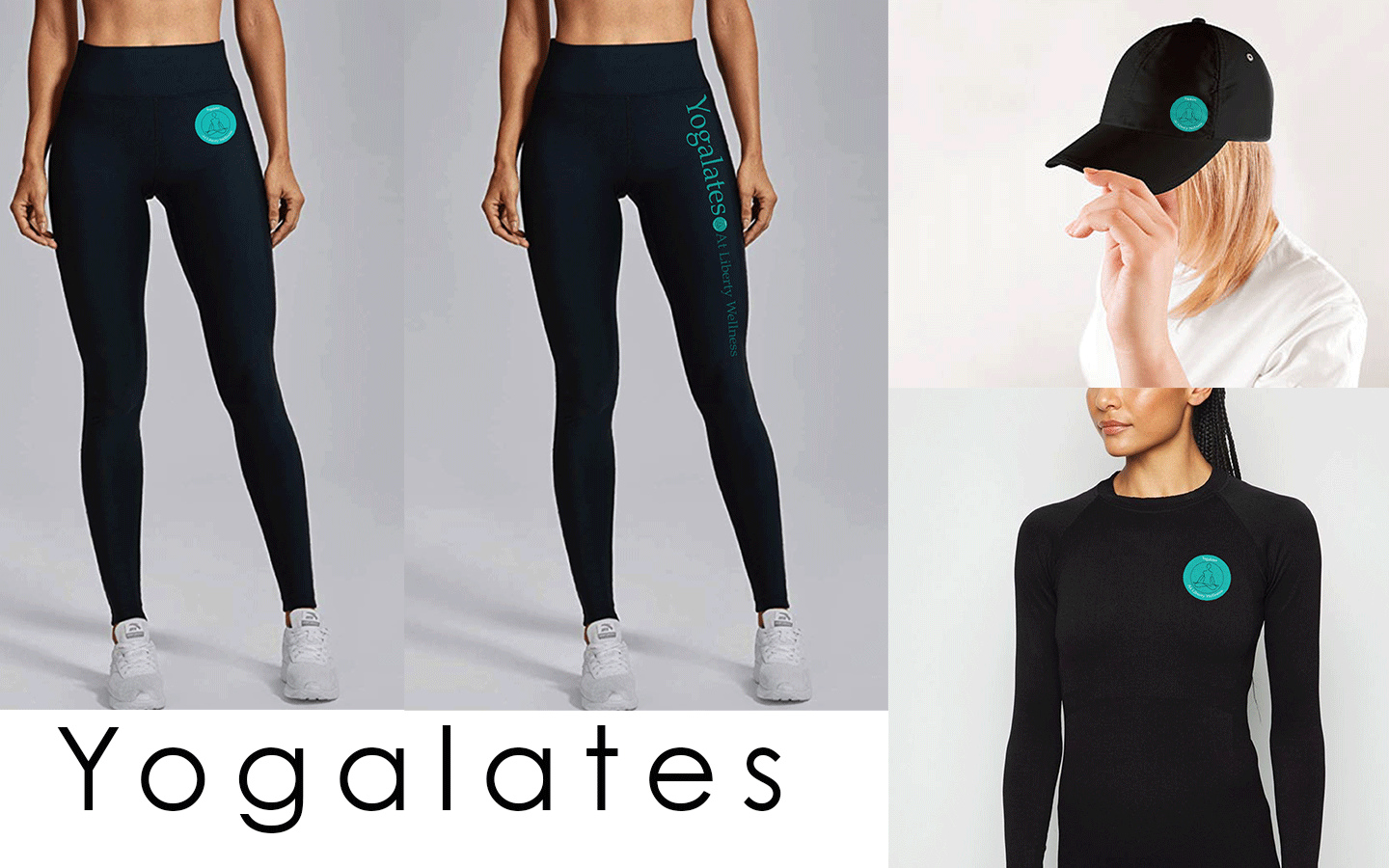
Yogalates | Pilates Wear
As part of my final project in a recent college course we were asked to design a clothing brand using Illustrator, Photoshop & InDesign.
I asked Carmel would she be interested in my design a clothing line for her Pilates & Yoga class. From here I decided to use deep tones of her green brand colour. I felt the logo needed to look different from her physical therapist business & so kept the design simple with an outline of a person in a sitting yoga position.
As the brief was 3 items of clothing, I felt a baseball hat, a t-shirt & leggings worked well together. The circular logo below didn't sit right on the leggings & so I created a further logo in plain type face to virtually ascend down the leg. This meant there would be 2 types of the clothing line available to the customer based solely on their preference. I decided to use only black fabric as the background to make the logo pop.